Typography is probably one of the most important and underrated parts of SaaS design. While your customers will never pay attention to your choice of font, they will surely sense its influence on readability, credibility, usability, and the overall experience of using the product.
Top SaaS businesses spend lots of money on typography because it influences how users interact with information and how a brand looks and feels like. Typography can help you create an image of a modern, premium, innovative, or enterprise-level product.
Whether it’s a landing page of a startup or an entire software platform, a good font selection can positively influence the user experience and engagement.
Here are ten fonts that top SaaS brands use today.
1. Geist
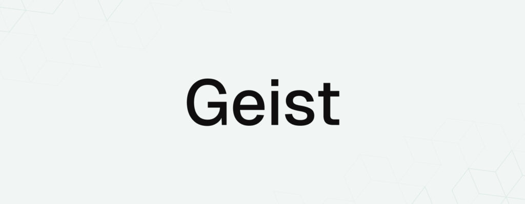
Geist has quickly become one of the most popular fonts among modern SaaS startups.
Designed by the developers of Vercel, Geist is an open-source font made exclusively for digital products. It is very readable, has good spacing, and looks extremely professional on dashboards, landing pages, and web applications.
Why It Works
- Designed for modern interfaces
- Exceptional screen readability
- Clean geometric structure
- Premium technology-focused aesthetic
Best For
AI products, developer tools, SaaS startups, and software platforms.
2. Inter
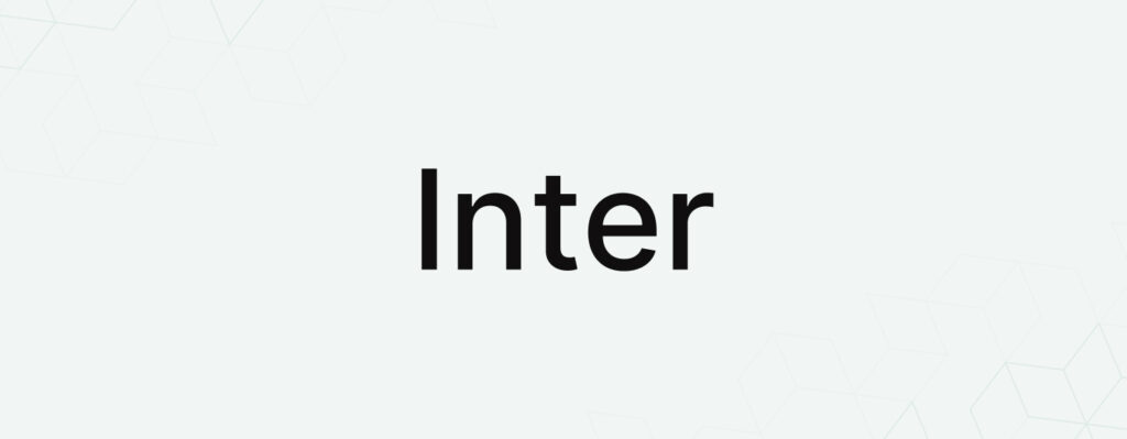
Inter remains one of the strongest choices for SaaS design.
Its versatility, clarity, and extensive character support make it suitable for everything from dashboards and analytics platforms to enterprise software systems.
Why It Works
- Highly readable at small sizes
- Optimized for digital interfaces
- Excellent font weight flexibility
- Trusted by thousands of SaaS brands
Best For
Dashboards, productivity tools, CRM platforms, and analytics software.
3. Plus Jakarta Sans
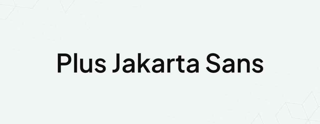
Plus Jakarta Sans has become a favorite among modern product designers.
It combines professionalism with warmth, making software products feel approachable without sacrificing credibility.
Why It Works
- Contemporary appearance
- Balanced typography
- Strong readability
- Excellent visual hierarchy
Best For
Fintech, HR software, project management tools, and startup websites.
4. Manrope
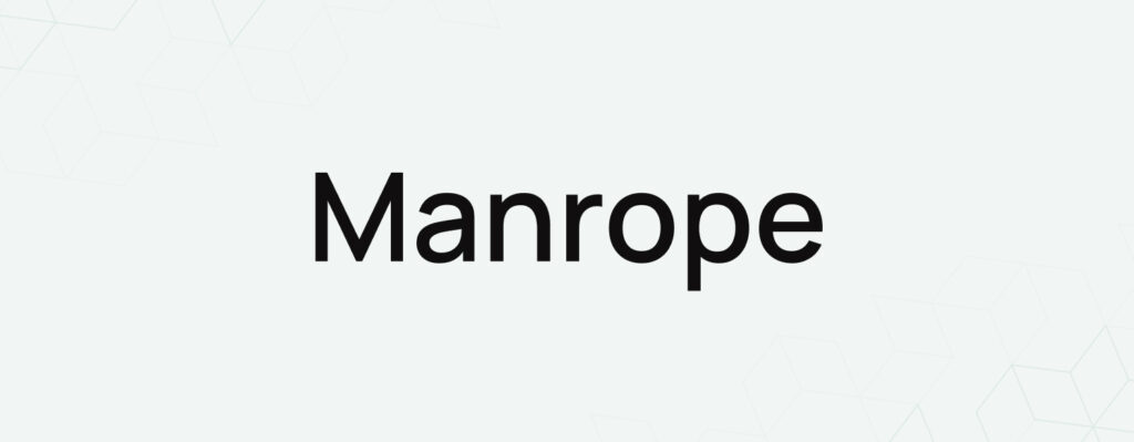
Manrope delivers a premium feel that few free fonts can match.
Its elegant curves and refined letterforms make SaaS products appear more sophisticated and trustworthy.
Why It Works
- Modern and polished
- Strong branding potential
- Excellent heading typography
- Works well across devices
Best For
Enterprise software, fintech solutions, and premium SaaS products.
5. Satoshi
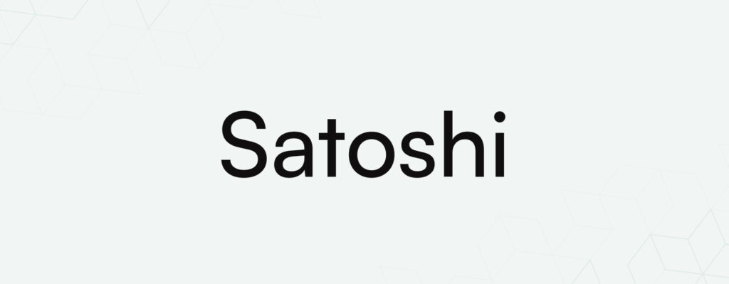
Satoshi has rapidly gained popularity among UI/UX designers and startup founders.
Its minimalist appearance makes interfaces feel clean, organized, and highly professional.
Why It Works
- Modern geometric design
- Outstanding readability
- Clean user interfaces
- Contemporary brand appeal
Best For
Startup landing pages, SaaS dashboards, and B2B software.
6. General Sans
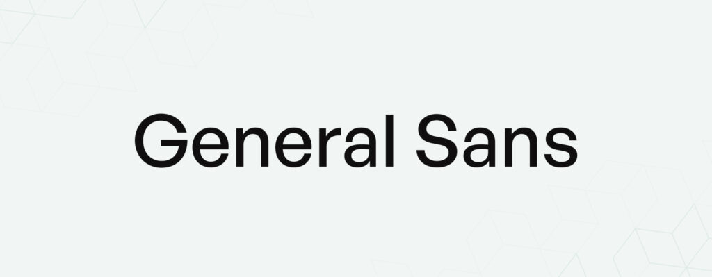
General Sans offers a unique blend of simplicity and personality.
It helps SaaS brands stand out while maintaining a professional and trustworthy appearance.
Why It Works
- Distinctive visual character
- Excellent legibility
- Balanced modern aesthetic
- Premium product feel
Best For
Design platforms, AI tools, marketing software, and creative SaaS products.
7. DM Sans
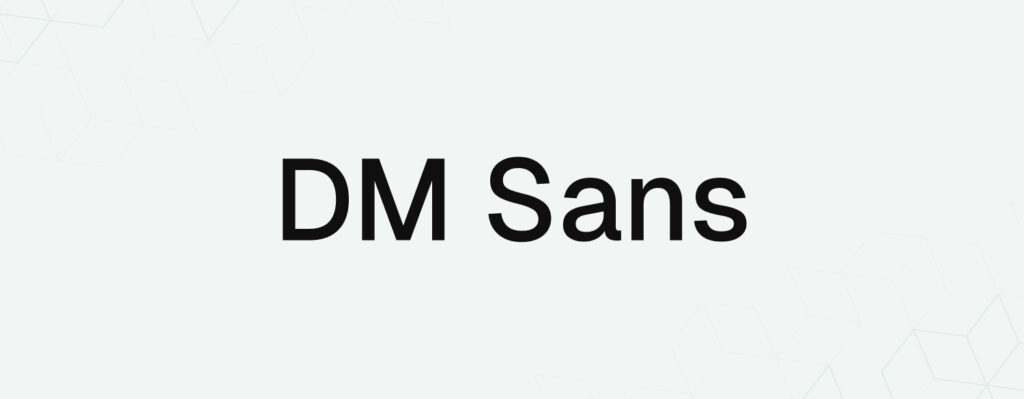
DM Sans continues to be a reliable choice for software companies seeking a clean and friendly appearance.
Its simplicity makes interfaces easier to scan and navigate.
Why It Works
- User-friendly design
- Great mobile readability
- Minimal visual clutter
- Strong UX performance
Best For
Customer-facing SaaS applications and mobile-first platforms.
8. Outfit
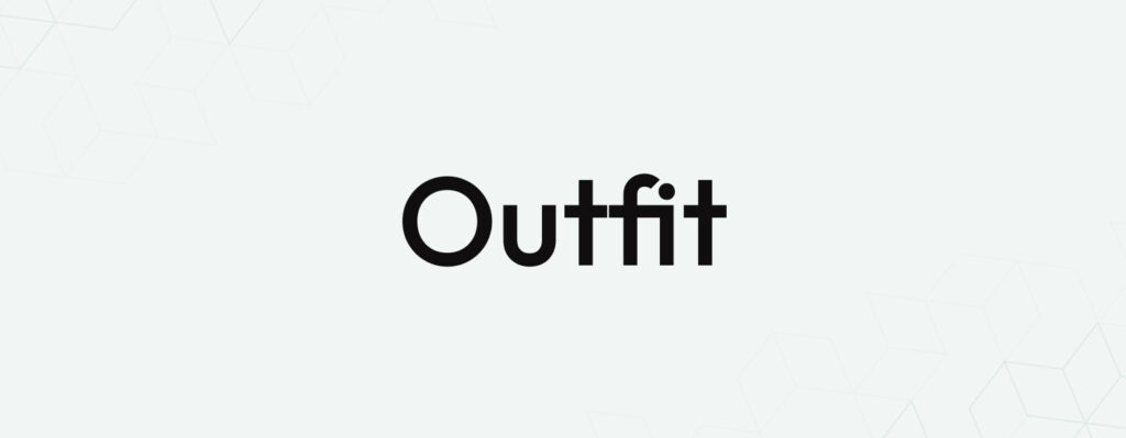
Outfit brings a fresh and innovative personality to digital products.
Unlike traditional corporate fonts, it helps brands feel modern and forward-thinking.
Why It Works
- Strong visual identity
- Modern character shapes
- Excellent branding flexibility
- Memorable appearance
Best For
AI companies, Web3 startups, creative platforms, and emerging technology products.
9. Space Grotesk
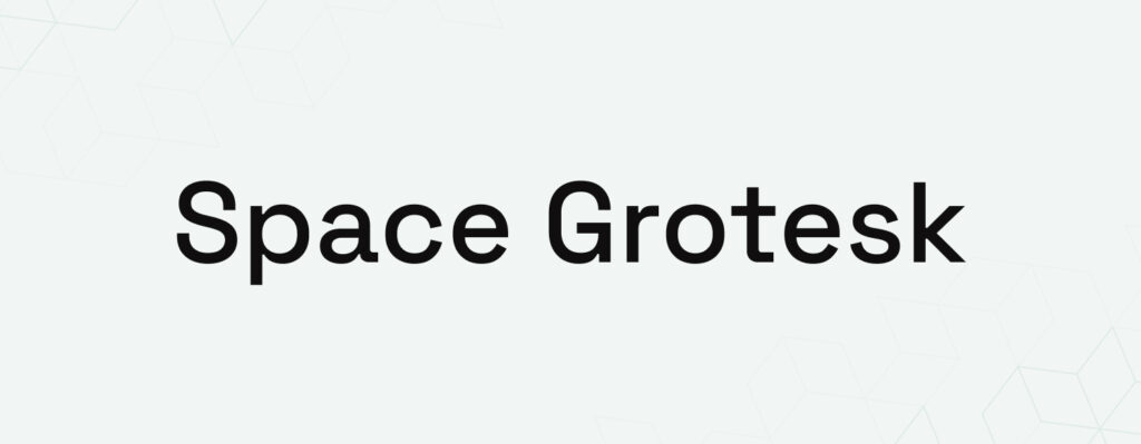
Space Grotesk has become increasingly popular among technology startups and AI companies.
It delivers a futuristic look without compromising usability.
Why It Works
- Unique personality
- High readability
- Innovative aesthetic
- Strong design presence
Best For
AI SaaS products, cybersecurity tools, and innovative software platforms.
10. IBM Plex Sans
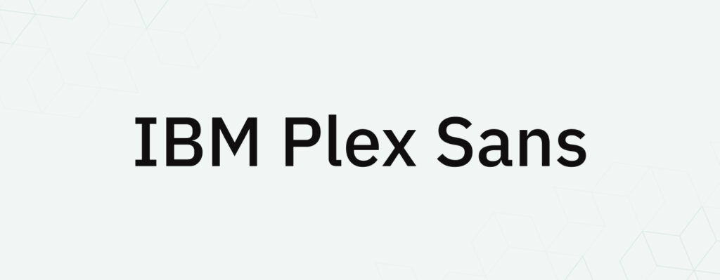
Designed by IBM, this typeface combines professionalism, usability, and technical precision.
It is particularly effective for enterprise-level software products.
Why It Works
- Corporate-grade readability
- Strong accessibility
- Professional appearance
- Trusted enterprise aesthetic
Best For
Enterprise SaaS, healthcare software, fintech solutions, and business applications.
Need Expert Digital Marketing for Growth?
Boost your online visibility, attract qualified leads, and grow your business with tailored digital marketing strategies.
Why Typography Matters in SaaS Design
SaaS products rely heavily on content, navigation, data visualization, onboarding flows, forms, dashboards, and documentation. Users often spend hours interacting with these interfaces.
The right typography can:
- Improve readability
- Increase user satisfaction
- Strengthen brand recognition
- Reduce cognitive load
- Improve accessibility
- Create a more polished user experience
A great font doesn’t just look attractive-it helps users accomplish tasks faster and more comfortably.
Best Font Pairings for SaaS Products
Choosing the right font pairing can elevate both branding and usability.
| Heading Font | Body Font |
|---|---|
| Geist | Inter |
| Satoshi | Plus Jakarta Sans |
| Manrope | Inter |
| Space Grotesk | DM Sans |
| General Sans | Inter |
| Outfit | Plus Jakarta Sans |
These combinations create strong hierarchy while maintaining consistency across the user experience.
Fonts Used by Leading SaaS Brands
Many successful SaaS companies prioritize typography as part of their design systems.
Popular font choices among modern SaaS products include:
- Inter
- Geist
- IBM Plex Sans
- DM Sans
- Manrope
- Plus Jakarta Sans
These fonts are widely adopted because they balance aesthetics, performance, and usability.
Common Typography Mistakes SaaS Companies Make
Even well-designed products can suffer from poor typography decisions.
Using Trendy Fonts Without Testing
A font may look impressive in a mockup but perform poorly in a real application.
Poor Font Hierarchy
Users should instantly understand the relationship between headings, subheadings, and content.
Ignoring Accessibility
Text should remain readable across all screen sizes and user abilities.
Too Many Font Families
Limiting typography to one or two families creates a more professional and cohesive experience.
Inconsistent Spacing
Typography extends beyond fonts-it includes line height, spacing, and visual rhythm.
How Great Typography Improves SaaS Conversion Rates
Typography affects every step of the user experience.
Good legibility of the text helps with onboarding, increases usability of the product, decreases confusion, and motivates the user to take necessary steps. Irrespective of whether it is the landing page that a person is going through or an advanced dashboard, typography affects their interaction with your product.
Businesses that prioritize typography end up designing more trustable and intuitive experiences.
Need Expert Digital Marketing for Growth?
Boost your online visibility, attract qualified leads, and grow your business with tailored digital marketing strategies.
Final Thoughts
Font selection is one of the easiest and at the same time the most efficient steps towards improving the SaaS product.
Although popular fonts like Inter and DM Sans continue to be industry norms, newer font families like Geist, Satoshi, General Sans, and Space Grotesk are assisting modern software brands to make their mark by offering distinctive user experience.
The perfect font does not have to be the most popular; rather it should be the typeface which aligns with your brand values and makes it easy for your users to accomplish their objectives.
For most SaaS startups in 2026, a combination of Geist + Inter or Satoshi + Plus Jakarta Sans offers one of the strongest foundations for a modern, conversion-focused product design.